
A massive traveling retrospective highlights Robert Rauschenberg’s achievements in a wide range of mediums and techniques. Here, the author unravels the complex imagery that reflects the artist’s personal history and political involvement.
Published Art in America, February 1998

Asked by this journal to write about “Robert Rauschenberg: A Retrospective,” which opened at the Guggenheim Museum in New York last September, I approached the exhibition with trepidation. I was troubled: how was I going to deal with the later work? In 1990, I completed a doctoral thesis entitled “Random Order: The First Fifteen Years of Robert Rauschenberg’s Art, 1949-64” at New York University’s Institute of Fine Arts; the same year saw the opening of “Robert Rauschenberg: The Silkscreen Paintings, 1962-64,” an exhibition I curated for the Whitney Museum of American Art. The focus of my study on Rauschenberg was on the artist’s early production—extending from the first existing paintings, through the Combines, to the Silkscreens—the work that has traditionally been viewed as the most historically significant and influential of his career. For the purposes of my research, the year 1964 presented a natural breaking point. As has often been recounted, when Rauschenberg won the first prize for painting at the Venice Biennale in the summer of 1964, he telephoned a friend in New York and asked him to destroy the screens that had been used to make the Silkscreen Paintings, thereby ensuring that he would not repeat himself but would move on to something new. During the remainder of the 1960s, he devoted himself to printmaking, art performances and technology-based art.
I thought that when Rauschenberg returned to more conventional forms of art-making (i.e., painting and sculpture) in the 1970s, much of the work was too heavily indebted to the early Combines and Silkscreens. Although some of the new series struck me as fascinating and beautiful, for the most part I found the later work lacked the profound brilliance, sensuality and breakthrough quality of what had come before. The newer work seemed repetitive, uneven and flawed. I thought Rauschenberg too prolific and wondered if his legendary drinking was affecting his ability to produce works of quality. I felt justified in my evaluation of his later work by the fact that most Rauschenberg scholarship—almost all of the “serious” art writing—focused on the Combines and Silkscreens. Moreover, criticism of Rauschenberg’s later work always seemed to me tinged with an enforced politeness, as if writers were at best ambivalent about the work and sought not to offend an established older master. (It is rare, though, to find words like “pathetic” used to describe his new work, as in a passing reference made by an anonymous critic in a recent issue of The New Yorker.)1 The comparatively low prices the later work tended to fetch in the marketplace seemed futher confirmation.
For me, the Guggenheim retrospective proved a revelation. I had been wrong in my assessment of Rauschenberg’s later work and blind to the true nature of the break that occurred in his art. To be confronted with a half-century’s worth of the artist’s production in its full range—paintings, sculptures, collages, prints, drawings, photographs, performances, dance theater work, technology-based pieces and so on—was no less than staggering. It is now clear to me that although Rauschenberg’s production since the 1960s has been uneven (some series seeming to exploit invention for its own sake), the late stages of his career are replete with works of quality and vision. I recognize that Rauschenberg’s output of the past 35 years is not lesser, but other, requiring a different approach, a new set of standards and fresh criteria to evaluate and understand. These works feature not only new methods, materials and manners of execution, but proceed from new motivations and intentions.

During the course of the 1960s, Rauschenberg redefined for himself what the role of an artist can be. He moved from working alone in his studio to working in collaboration. He shifted his focus from local concerns (autobiography, the self and his immediate urban environment) to a broader involvement with American politics and society, which then expanded to an engagement with global issues, international cultures and the state of the world. Rauschenberg also changed the mode of address employed in his work; rather than being geared to a lone individual standing before the work, it addressed a larger audience, the tendency toward the poetic and poignant in his work thereby giving way to the operatic and grand. It will be demonstrated, however, that the basic language spoken by Rauschenberg’s work throughout his career remained unaltered.
The traveling retrospective gives us the opportunity to review the whole of Rauschenberg’s mutifaceted, multidirectional career—to identify lines of continuity that can be drawn between the earliest and most recent works, as well as major shifts and departures. As Rauschenberg’s exhibition comes on the heels of the major Jasper Johns retrospective presented at the Museum of Modern Art a year ago, certain aspects of the artistic relationship between these artists who became linked at a crucial period in their work will be considered. The primary purpose of this piece, however, is to demonstrate that Rauschenberg’s achievements of the past 35 years are equal to—though substantially different from—those of his early career.
“Robert Rauschenberg: A Retrospective” was organized by Walter Hopps, who also curated Rauschenberg’s last major U.S. retrospective, held at the National Collection of Fine Arts (now the National Museum of American Art) in Washington, D.C., in 1976; the exhibition travelled nationally, being seen in New York at the Museum of Modern Art. In 1991, Hopps was also responsible for “Robert Rauschenberg: The Early 1950s,” organized for the Menil Collection, Houston; this exhibition also traveled nationally, being presented at the Guggenheim SoHo in fall 1992 [see A.i.A, Apr. ’92]. The massive new exhibition, which is being shown in slightly reduced form elsewhere in the U.S. and abroad, consisted in New York of over 400 works. It occupied almost the whole of the uptown Guggenheim Museum (the exception being the single side gallery reserved for the permanent display of the Thannhauser Collection), the entire Guggenheim SoHo and the capacious Ace Gallery on Hudson Street, where The 1/4 Mile or 2 Furlong Piece (1981-present) was displayed. The exhibition catalogue, at well over 600 pages, is equally huge. It brings every aspect of Rauschenberg’s career and production into focus, some, like the artist’s longstanding preoccupation with dance and philanthropic endeavors (the latter recounted in the “Chronology”), more clearly than ever before. The uptown Guggenheim presented work from about 1950 to 1990, organized chronologically beginning near the bottom of the ramp; the side galleries offered detours into pieces produced in a wide variety of mediums, although most of the works on paper were seen here. Rauschenberg’s technology-based works and performance-related pieces of the late ’50s and ’60s were shown on the ground floor of the Guggenheim SoHo, while paintings and sculptures from about 1985 to the present were exhibited on the second floor. In addition to the display at Ace Gallery, which was part of the Guggenheim show, Rauschenberg’s production was featured in many commercial galleries around town: works from Rauschenberg’s most recent series, the Arcadian Retreats, were shown at PaceWildenstein Gallery on 57th Street; PaceWildenstein/McGill featured a mini-retrospective of Rauschenberg photographs reprinted using the newly available digital ink-jet printing process; Jim Kempner Fine Art in Chelsea offered a mini-retrospective of Rauschenberg prints; at Quartet Editions in SoHo, Graphicstudio showed individual photographs related to Rauschenberg’s 100-foot-long photographic project Chinese Summerhall (1982-84); and Gemini G.E.L. at Joni Moisant Weyl presented prints and multiples by Rauschenberg from the artist’s collection being sold to benefit Change, Inc., a foundation he established in 1970 to provide emergency funds to artists in need.
One of the first works to greet the visitor near the bottom of the ramp at the uptown Guggenheim was a dynamic and prophetic work: a double-portrait photogram of Rauschenberg made around 1950 in collaboration with his then wife, the artist Susan Weil. Created by lying naked directly on blueprint paper and then exposing the paper to light (a sunlamp), it presents a flattened, life-size index of the human form; the work looks ahead to the tracing of the naked form in Wager (1959), the X ray of Rauschenberg’s body in Booster (1967) and the multitude of traced figures in The 1/4 Mile Piece. As a double, reversed image, it anticipates the doublings and reversals that are a mainstay of his art to the present day. The fact that he appears to be balancing on his own head, like an acrobat or dancer, looks ahead to his collaborations in the fields of dance and performance. Metaphorically speaking, in this work executed at the veiy inception of his career, Rauschenberg supports his own weight; in later work he assigns himself a more formidable task— bearing the weight of the world.

As one turned the corner into the first tower gallery, one found an elegant and thorough display of early work; executed in a vast array of mediums, most of this work was seen in both of Hopps’s earlier Rauschenberg exhibitions. Included were White Paintings, Black Paintings and Elemental Sculptures; the Erased de Kooning Drawing; early Joseph Cornell-inspired box sculptures; paper collages; photographs; early transfer drawings; Dirt Painting (for John Cage); and a few Gold Paintings. Rich both in surface effects and material, the latter are a series of small, square works whose surfaces are covered over with gold (and sometimes also silver) leaf. These paintings call to mind Rauschenberg’s preoccupation since the mid-’80s with costly metallic supports of brass, bronze, aluminum and copper, materials exploited for their colors, reflective properties and patinas. The Gold Paintings, however, were executed in 1953 as part of a series of works in which Rauschenberg challenged people’s perceptions of the esthetic and monetary value of materials found in works of art. (He also created a number of allover compositions in “base” materials like dirt and pink tissue paper.) Rauschenberg’s personal lack of prejudice with regard to materials—his unwillingness to recognize hierarchies—has been among the most important features of his work throughout his career. He has demonstrated time and again that he can make art out of anything: a rusty nail and block of wood, a crumpled bit of metal, a shiny length of fabric, an expanse of mirrored aluminum and steel, a vat filled with mud.
The exhibition continued back on the ramp with the Red Paintings, which began much like the Black Paintings, their surfaces layered with newspaper and other flat collage elements which were entirely covered over with paint. Then, in 1954, something happened. From the restraint and discipline of his earlier works, Rauschenberg moved to the opposite pole, the change in his art occurring like an explosion or release. The new works were splashy, extroverted, theatrical and excessive. While paintings displayed at the Guggenheim managed to trace that change—his move to an expressionist handling of paint and materials and his progressive unveiling of the collage elements and exploitation of these elements as carriers of content—many of the important works of this defining moment in Rauschenberg’s career were absent, among them Untitled (with stained glass window), Pink Door, Collection and Charlene. Museums and collectors were apparently unwilling to lend the works (conservation reasons no doubt played a large role). Collection, for example, is a large-scale piece that features a wide range of predominantly flat collage materials, among them newspaper articles and funny papers, magazine photographs and printed art reproductions, blank sheets of paper, plain and printed fabrics, the lid of a cigar tin, a round mirror and bits of wood, assembled in rectilinear fashion on three wood panels. The bottom third of each panel is in turn divided into three vertical zones randomly painted in red, yellow or blue. One finds in this work that Rauschenberg was already well on his way to cultivating the personal repertory of gestural paint marks that he was to draw from and expand over the next several years–drips, splatters, heavily impastoed scribbles, flatly painted areas, thick lines of paint squeezed directly from the tub and “hinge” strokes, horizontal marks made with a loaded brush from which little rivulets of paint drip abundantly down the surface, uniting the collage materials and other brushstrokes in their wake.

The Guggenheim did its best to compensate for the absence of Collection and other important works by featuring a number of small, fascinating but minor works and by exhibiting Minutiae (1954) here, rather than downtown with the performance-related works where it belonged. Designed as a set for a Merce Cunningham dance of that name, the freestanding Minutiae is an intricately realized work whose collaged and painted surfaces recall those of Collection. In Minutiae, however, collaged panels, transparent fabrics and loosely hanging scrims of fabric are manipulated to provide multiple doorways and windows through which dancers could move and be seen.
The Whitney Museum’s Yoicks (1954), a key work in the transition that occurred in Rauschenberg’s art at this time, also appeared in the exhibition. The painting is unquestionably directly related to Jasper Johns’s Flag (executed the same year) and provokes the riddle, “Which came first, the chicken or the egg?” Yoicks (measuring 8 by 6 feet) consists of two horizontal panels vertically joined, each panel the proportions of Johns’s Flag. In a manner extremely uncharacteristic of Rauschenberg, the painting features a regular pattern of red and yellowish-white horizontal stripes formed by alternating paint with strips of fabric—the fabric white with green polka dots. It is Rauschenberg’s version of the American flag.2 (In any number of the artist’s later works, as seen in the lower-left corner of the silkscreen painting Die Hard, 1963, striped fabrics in some combinations of ned-white-and-blue are called upon to play this role.)
While Rauschenberg and Johns apparently first met in 1953, their intense personal and artistic relationship dates to a year later and was to continue until mid-1961. During the period of their close association, they lived in the same building, saw each other’s work daily and engaged in dialogue about their art. By 1954, Rauschenberg had already earned the reputation of enfant terrible of the New York School; he had been exhibiting for several years, was a member of the Artists Club formed by first-generation Abstract Expressionists and was a frequent visitor to the Cedar Tavern, the favorite haunt of the leading artists of the time. Johns, five years his junior, was new to New York and untrained as an artist (in contrast, Rauschenberg had attended numerous prominent art schools). Although Johns was to destroy all of the work in his hands executed prior to Flag, the few surviving works, several of which were featured in Johns’s MOMA retrospective, reveal that he was initially strongly influenced bv the work of his friend—he absorbed Rauschenberg’s esthetic before moving on to develop his own.

Although Johns was soon to go in a different direction in his own work, I believe he gave Rauschenberg permission to be himself—to break free of any constraints on form and content imposed by assumptions then prevalent on the New York scene and to create an art fully expressive of his romantic, passionate nature, his high energy and spirits and his personal view and experience of the world, including his homosexuality. Untitled (with stained glass window), 1954, identified by Hopps as Rauschenberg’s first Combine, is a love song; indeed, Rauschenberg told its owner some years ago that it was painted at a time of passion for a friend.3 Its surface is covered with paint, fabric and paper (especially comics) and is extremely lyric and free, with a profusion of drips and splatters and with several passages in which mauve, olive green and a creamy tone all run meltingly together. Behind the stained-glass panel at the top of the work are three yellow bug lights which Rauschenberg told me had a practical function—not only did they ward off insects but they served as a night-light,4 casting this exceedingly romantic work and the space before it in a golden glow.

The direction Rauschenberg was now to take in his art—one in which collage materials were exploited as aspects of an associative content— was anticipated by his 1950-51 painting Should Love Come First? A collage of printed papers arranged in a rectilinear pattern against a white ground, it consists of signs and images of varying sorts that were selected and juxtaposed to form clusters of meaning. The linkages revoke around themes of sequentiality (the “first” of the painting’s title, the images of some 200 clocks and the sequence of numbers 1 through 8 extending from the shoeprints in the dance-step diagram to the page numbers printed and collaged on the page with the clocks), patterns of movement (the dance-step diagram and Rauschenberg’s actual footprint) and sexuality (implied in the title and in the fact that the footprint doubles as a phallus, its tip pointing at a reproduction of Monet’s Cliffs at Etretat, the orifice long ago nicknamed “porte de dame”). While this work is known to have been present in the back room at Rauschenberg’s 1951 exhibition at the Betty Parsons Gallery (it was photographed there by Aaron Siskind), it was not actually exhibited in the show, probably because, of all Rauschenberg’s works from this time, it was the most personal and the one least connected to New York School concerns. In 1952, the artist painted over this work with black paint, transforming it into a Black Painting, thereby offering a literal manifestation of the fact that his interest in content, reading and meaning was for several years submerged, only to resurface late in 1954 with the Combines.
In the mid-’50s, Johns took the path of concealment: his Flag, Target and Numbers paintings, formed by newspaper collage under hardened shields of encaustic paint, were characterized by self-repression and denial (“I have tried to develop my thinking in such a way that the work I do isn’t me”). In diametric opposition, the content of most of Rauschenberg’s earliest Combines was centered on autobiography and self. A freestanding untitled work from ca. 1954 contains a bevy of direct personal references: among the collage materials are family snapshots, newspaper clippings about his parents’ silver wedding anniversary and about his sister being named Louisiana Yam Queen and photographs of his ex-wife Susan Weil, of his young son Christopher and of Jasper Johns.5 An image of a young man in a white suit is reflected in a mirror, recalling Narcissus at the pool, the young man seeming to “strut his stuff” like the stuffed hen standing beside him. A white suit was worn by the artist at his wedding and the actual white shoes and socks displayed in the box above may well be the very ones that he wore.6 Thus the work offers reflections on his home, family, early marriage and fatherhood, and homosexuality. At the same time, like Odalisk (1955-58), which is often seen as its companion piece, the work explores gender stereotypes and levels hierarchies of printed matter, as when pornographic images of women are juxtaposed with reproductions of nudes from old-master paintings.

In an extended series of works from 1959— Canyon, Summerstorm, Wager, Photograph, Dam and Allegory, among others—Rauschenberg dealt in a direct and concentrated way with the theme of homosexual love, developing a personal iconography of signs and symbols. The first three works were included in the Guggenheim retrospective. Kenneth Bendiner’s interpretation of Canyon as related to the ancient myth of Ganymede (the story in which Zeus, having fallen in love with a human male child, transforms himself into an eagle which carries the boy to Olympus) is today well known to scholars.7 Summerstorm seems to offer a quasi-narrative of Rauschenberg’s own devising. A scorekeeping sheet bearing the initials “B [Bob?], A, G and J [Jasper?]” appears at the bottom of the work’s central panel, suggesting that a card or board game was played during a summer storm. As is typical of the works in this series, the collage materials include numerous fragments of men’s clothing, among them shirt cuffs, shirt pockets, a tie and a prominently displayed pants zipper, intimating that the game was not the player’s only preoccupation during the storm. While the poster letters included in this work are not legible, in other Combines the phrases “Your Ass,” “You Want” and “Great Column” can be read. Other works also include a puckered round form, the central portion of an umbrella, representing, no doubt, an anus. (This element figures prominently in Kickback [1959] and Allegory [1960] and a similar form was seen earlier in an untitled work of 1955 in Johns’s collection, which includes among its collage elements a question cut out of a newspaper or magazine, “Does God Really Care?”) Scrawled on a sheet of paper collaged onto the surface of Wager is a paraphrase of a suggestion made by Marcel Duchamp in Green Box promoting the use of such unlikely doubles.8 On Wager’s right-hand panel is a life-size outline pencil drawing of a nude male figure, presumably the artist, possibly traced by Johns, looking ahead to the tracing of Johns’s shadow on the surfaces of his Seasons paintings of 1985-86. (In the Rauschenberg, a loincoth is provided, although it is set too low on the panel to offer concealment.)
While the personal and homoerotic content of the Combines discussed above is, I believe, fascinating and revealing of the artist’s interests and motivations of this time, far more important for understanding Rauschenberg’s development is comprehending the manner in which this content is conveyed—through the associations and suggestions offered by fragments. In 1957, Rauschenberg produced two demonstration pieces in this regard, a pair of near-identical collage paintings titled Factum I and Factum II. A “factum” is a statement of the facts of a case or controversy and these works offer public statements about the nature and intentions of his art.

Like its twin (which was not included in the exhibition), Factum I includes the following: a sheet of paper with several columns of handwritten numbers; a 1958 calendar oriented in two directions and lacking the month of November; two photographs of a building on fire taken from the Dec. 2,1957, Daily News, one of which represents a slightly later moment and a closer point of view; two seemingly identical photographs of President Eisenhower; a magazine photograph of trees before a lake and cloudy sky; and the letter “T.” The “T” might be taken to stand for “two” (as in two trees, two “Ikes,” two photographs of the fire and two points of view), for “time” (as indicated by the calendar and the sequential Daily News photographs) and for “tree.” The shape of the “T” echoes that of the trees and a contrast is thereby established between a flat, abstract sign and an illusionistic representation of the natural world. In a similar manner, the puffy white clouds seen through the trees play against the white polka-dot fabric nearby. The contrast between the organic and the mechanically produced (and thus also between the regular and irregular) is repeated by the printed calendar and hand-scrawled list of numbers. The same dichotomy is in operation within the larger context of the work: it is found in the contrast between the mechanically reproduced images and the seemingly intuitive and random touches of paint. The same issues are raised and the complexities and ironies multiplied when one encounters Factum II.
Throughout his career, by stimulating patterns of sight and thought, Rauschenberg has sought to reveal that order can be discovered within apparent randomness. He has called this defining principle of his art “Random Order.”9 He takes images out of context and juxtaposes them with other, similarly displaced images, so as to generate complex interlockings of meaning and form, the underlying grid of Cubism providing the structure within which elements are arranged.10 Like elements of a pictographic language, the objects and images engage in an associative dialogue across the surfaces of the works, their nonhierarchical clusters evoking a multiplicity of references.11 The work remains multidirectional and open-ended, poetic and evocative; meaning is inherent but impossible to pin down precisely.
While so massive a celebration of Rauschenberg’s art as found in the Guggenheim retrospective is the artist’s due, I believe it is detrimental to the art—or, more correctly speaking, to people’s perceptions of the art—as it seems to promote what Brian O’Doherty, writing in these pages in 1973, termed the “vernacular glance,” the city dweller’s rapid and disinterested scan, which refuses to recognize any meaningful connections among the objects and images.12 Yet Rauschenberg’s work demands close looking—the very antithesis of the “rapid scan”; as the artist himself said some years ago, “looking [like listening) also has to happen in time.”13 His self-proclaimed aim was “to make a surface which invited a constant change of focus and an examination of detail,”14 a surface sufficiently rich in form and content to reward scrutiny by both the eye and mind.

Although Rauschenberg has always tended to work spontaneously, inspired by the images at hand and his concerns of the moment, his is a highly self-conscious art in which innumerable formal and iconographic decisions are made in the process of working. Rauschenberg does not merely hold a mirror up to the world’s multiplicity; rather, he exploits multiplicity to reveal something universal and profound about consciousness and mind in the contemporary era. Although not didactic, his work demonstrates how to receive and process information and how to find order and connectivity in an apparently haphazard and discontinuous world.
In perceiving order and linkages, we find some measure of solace; we are given a sense of control in a world we cannot control. “Random Order” might therefore be recognized as more than just a principle of artmaking for Rauschenberg; it assumes the quality of a mission. As a child Rauschenberg was a devotee of the Church of Christ; he had wanted to be a minister with the power to reach people, to do good works. Without preaching or striking poses, by continuing to operate with wit, curiosity, vigor and joy, he took a different path toward the same goal.
To demonstrate the continuity of “Random Order” as a guiding principle in his art and as a distinctive quality of his thought and vision, one can look from Should Love Come First? to the Factum twins to such works as Master Pasture (Urban Bourbon), 1989, exhibited at the Guggenheim SoHo. Executed in acrylic on mirrored and enameled aluminum, the work features a seemingly disjunctive collection of marks and images which fuse upon close inspection. The image of a herd of cows in a pasture staring out at the viewer shares a frontal plane (and a casting of shadows) with the image of cloth on a clothesline that appears alongside. The orange and white image of the clothesline is overlapped by a series of gestural strokes, which are echoed by larger orange and white paint strokes at the upper right. A child’s drawing of a person (a photograph taken by Rauschenberg in Chile) is juxtaposed with the image of caryatids on a classical building, establishing a contrast between different modes of representation (linear/sculptural, informal/formal), while the reflection of our own heads in the shiny mirrored section below further complicates the dialogue. The virtual flatness of the mirror opposes the illusionism of the pale orange cubic form upon which the laundry is screened, which also plays against the angled volume of the classical architecture and the image of a modern scaffold beside.
The images in Master Pasture were transferred to the metal surface through a silkscreen process, which Rauschenberg first used in an extended series of works on canvas begun in 1962. Inspired by Andy Warhol’s use of the medium and immediately recognizing its potential for his own art, Rauschenberg began his Silkscreen Painting series in black and white, creating works such as Brace, Crocus and Tideline, seen in the uptown Guggenheim. In these works, gesturally screened images drift and float in associative dialogues revolving around romantic themes (baseball, sexuality) in the midst of hand-painted touches and marks.
By 1963, Rauschenberg was working in color and addressing himself to a fundamentally different kind of content, one focused on American governmental policy: the escalating war in Vietnam, nuclear armaments and the space program (the only policy he supported). The artist, who had previously been thought to be uncritically accepting of the world about him, subscribing to an “aesthetics of indifference,”15 now asserted his political engagements. Upon seeing Estate (1963) in 1964, Max Kozloff wrote, “it is no inchoate mentality that presents us, in daring stroke, with a clocklike electrical diagram superimposed upon Michelangelo’s Sistine Last Judgement. This is, after all, the artist who has illustrated Dante, who punctuates his imagery with stop signs and who shows the light going out in a series of four photographs of a glass of water. … It may be too vulgar to think of the overall melange as hellish, but bright hints of disaster and dissolution are certainly not excluded from Rauschenberg’s iconography.”16

Just before beginning the Silkscreen Paintings in 1962, Rauschenberg made his first prints. At first he was resistant to printmaking, famously having claimed “the second half of the 20th century is no time to start drawing on rocks.” Printmaking, however, the original means for the mass dissemination of images and information, was a natural medium for the artist, particularly given his increasing involvement with political and social concerns, and from the moment he relented and began making prints, he became a master. His first major prints, Urban and Suburban (1962), made at U.L.A.E. (Universal Limited Art Editions), featured clusters of images made from lead type and zinc cuts of newspaper photographs acquired from the New York Times as well as imprints of found objects (a saw, leaf and sheet of notebook paper). Through the years (now with 800 some-odd print editions behind him), Rauschenberg continued to revolutionize the medium, developing a multitude of groundbreaking techniques for depositing images on paper.
Moreover, as his reputation as an artist grew and he found himself with increasing visibility (and financial capability), Rauschenberg chose to exploit art as power, using his art to publicly support causes in which he believes. I would venture to guess that from the early ’60s, when he designed mass edition posters for the Congress for Racial Equality (and secretly financed the Artists’ Peace Tower against the Vietnam War, erected in Los Angeles17) through his Earth Day posters and prints created in support of political candidates, to his recent work for United Nations conferences on the environment and human settlements, no living artist has produced more work in this vein and become more personally involved. When someone remarked to him recently about having been surprised not that he designed prints for two recent U.N. conferences, one in Brazil and the other in Istanbul, but that he actually attended the meetings, Rauschenberg replied, “I’m not running a design studio, you know,” meaning that his engagement with the organizations and causes he supports extends into the very fabric of his life. Further evidence is found in the number of times Rauschenberg has appeared at Congressional subcommittee hearings, addressing issues ranging from artists’ rights to support for the NEA. In most cases, there is a difference between Rauschenberg’s “art” prints (prints made for himself) and the commissioned mass editions (those made for others); the former tend to be veiled and evocative while the latter are clearly legible in their iconography and images. In a few of Rauschenberg’s prints and drawings from about 1970, however, there is little or no difference between the two sets of work, as in the 54-foot-long screenprint Currents (1970), made up of newspaper headlines, which Rauschenberg said was intended “as an active protest attempting to share and communicate my response to and concern with our grave times and place.”18
Although the year 1964 witnessed a turning point in his career, certain changes—like the move to working in collaboration in print workshops and to enhanced political engage ment—began somewhat earlier. These changes, which represented Rauschenberg’s moving outside of himself and the studio environment, followed the termination of his close personal relationship with Jasper Johns (in mid-1961).19 It was also at this point that the Guggenheim retrospective moved downtown to SoHo for the artist’s other collaborations of this time: technology-based art and performance work.

The installation of Rauschenberg’s “experiments” in art and technology, all of them spruced up and in good working order, was among the highpoints of the retrospective. One could whistle into the microphone in Dry Cell (1963) and see the little glob of metal spin (like the propeller blades of the helicopter screened onto its Plexiglas face); walk among the components of Oracle (1962-65) that are generally cordoned off in their own space and be jarred by the radio static while being soothed by the bathtub/fountain; push the buttons of Revolvers (1967) and see the changing relationships of the screened images; hear and see the goop in Mud Muse (1968-71) bubble and leap several feet into the air; be aroused by the overtly erotic and accurately time-keeping Carnal Clocks (1969); and stamp and tap-dance one’s way down the length of Soundings (1968), exchanging one’s reflections in the mirrored Plexiglas for the images of a multitude of empty chairs. Seeming to serve both as an invitation to sit down and as a reminder that we are standing up, Soundings as a whole exudes a warmth and friendliness by virtue of its golden tones, inviting imagery and responsiveness to our actions.

In 1967, Rauschenberg and Billy Kluver, an engineer who collaborated with the artist on most of the projects described here, founded EAT.—Experiments in Art and Technology—a nonprofit organization with a Utopian aim. The basic idea behind E.A.T. was that by having artists and engineers work in tandem, artists would make works which exploited newly available materials and technologies, while engineers, influenced by the artist, would humanize technology. Since this moment in contemporary art history is often overlooked, it is helpful to remember that a preoccupation with art and technology was widespread among artists in the mid-’60s. Rauschenberg was a leading figure in a larger trend, as is witnessed by the spate of group exhibitions in which he participated, among them “The Machine As Seen at the End of the Machine Age” at the Museum of Modern Art in 1969 and “Art and Technology” at the Los Angeles County Museum (for which Mud Muse was designed) in 1971.
As many of Rauschenberg’s technology-based works were participatory or performance-oriented, it was appropriate that they shared the floor with objects and photographs documenting his performances and dance-theater works. While the video of his performance work shown in the gallery was excellent (and should be made widely available), the relics of the performances laid out on a platform were much less interesting than the numerous essays on Rauschenberg’s involvement with performance found in the exhibition catalogue. Particularly illuminating were Steve Paxton’s and Trisha Brown’s unassuming, first-person accounts of having watched Rauschenberg in action designing sets, costumes and dances, bringing to the stage his energy, inventiveness and theatrical flair. One realized that Rauschenberg’s accomplishments in dance-theater design are equivalent to his achievements in the visual arts, his use of everyday objects and images, live animals, slide and film projections, among other things, having anticipated, if not influenced, other artists who have designed for the stage and screen, from Johns to David Salle to Matthew Barney.
Around 1970, Rauschenberg’s engagement with the “alternative” art form of performance ceased, as did his preoccupation with mechanically powered work. His politically motivated Currents was exhibited and, seeking relief from the intense focus on real-world problems required in the execution of this work, Rauschenberg returned to an art of assemblage and collage. It was also at this point that he moved from Manhattan to Captiva Island off the west coast of Florida and that the Guggenheim retrospective moved back uptown.

Rauschenberg’s work of the 70s is problematic, with some low points, some high and some hovering in between. The works from the Cardboard series, for example, in which Rauschenberg displaced ordinary shipping cartons to the gallery wall with only minimal interference and alteration, looked exuberant and beautiful. The viewer stands and studies the compositions and surface details (staples, tape, printed labels, smudges of dirt), then suddenly catches him- or herself, embarrassed at having brought this degree of esthetic contemplation to so humble an object, which, of course, was Rauschenberg’s very point. The pieces in the Hoarfrost and Jammer series, however, in which unstretched fabrics are attached to the wall (the fabrics imprinted with images and newsprint in the former; solid-colored silks, satins and cottons in the latter), looked awful displayed in the dimly lit, confining bays of the Guggenheim ramp. As Glacier (1974) floated gloriously against the wall of a light-filled gallery downstairs and as I retain a memory of a sunny, breezy exhibition of Jammers at the Castelli Gallery in 1976, I believe their poor showing here was, in large part, the fault of the installation. No installation in the world, however, could have saved most of the works in the Early Egyptian and Pyramid series—although I confess a peculiar affection for an untitled Early Egyptian of 1973, a towerlike form with a Mike Kelleyesque pink-and-white floppy pillow at the top. Sor Aqua (from the 1973 Venetian series), installed in a generously proportioned, high-ceilinged space, looked remarkably beautiful, its individually unassuming parts forming an elegant composite silhouette. An assemblage consisting of crumpled metal and a wooden beam suspended high above a water-filled bathtub (a glass jug floats in the water), it suggests a figure in flowing drapery hovering over the sea (as might be found in Venetian paintings of old). In the mid-’70s, Rauschenberg began to produce the Spreads and Scales, shaped, Combine-like works which incorporate transferred images and found objects. These, however, are Combines with difference, as the colors are bright (pastels and primaries), the surfaces smooth and clean, the edges sharp and precise and there is not an expressionist mark in sight. An exception is found in Miter I (from the Scale series, 1980), in which Rauschenberg symbolically discarded his paintbrush: a brush was used to make its final mark and was then left behind, attached to the picture surface (near the composition’s left edge). In this work, one also finds evidence of a change in subject matter, its images focusing not on American life but on non-Western cultures, the global focus reinforced by the world map attached at the bottom right.

In Miter I and in all of Rauschenberg’s subsequent work, the images do not depict the so-called global village, an Americanized world with a McDonald’s and Gap store on every corner; instead, local cultures and indigenous traditions are presented and celebrated. Occasionally, images of poverty and starvation are seen. That Rauschenberg’s internationalism was linked with a sense of mission, one with a religious tie, is suggested by the fact that superimposed upon the world map at the bottommost point of the composition is an image of Jesus. The religious connotations of this particular work are enhanced when one realizes that a “miter” is both a beveled edge of the sort involved in the construction of the work’s shape and a liturgical headdress worn by bishops and abbots. The white-painted bicycle in Miter I also serves symbolic purpose; from this point forward, the bicycle plays an important role in his art. It serves on the one hand as an internationally available, ecologically sound means of transport and on the other hand as a “rocket,” as the neon-outlined bicycle produced in conjunction with his later international projects was named—a vehicle that travels to a higher realm.

The uptown Guggenheim presentation ended in the topmost tower gallery with works from the Rauschenberg Overseas Cultural Interchange (ROCI) series. Rauschenberg had first begun to travel internationally with the express purpose of producing work when he went to France in 1973 and to India in 1974, in both cases collaborating with local artisans on handmade paper pieces. Around 1980, he conceived the plan of traveling around the world, creating works employing images and techniques from various sites, which would be displayed in an over-larger accompanying exhibition. ROCI was to take him to 11 countries and to occupy him through 1991, when the exhibition terminated at the National Gallery in Washington, D.C. [see A.i.A., April ’92]. The project, which was largely self-financed, involved extensive planning and intense negotiations, particularly because his interest was in traveling to politically sensitive areas such as Venezuela, Chile, Cuba and the former East Berlin (before the wall came down; he did not get clearance to exhibit there, however, until after). Although he was honored by Castro with an official dinner in Havana, for those who can “read” his imagery it is evident that the work he created for display in Cuba was not politically neutral. Yellow Ranch (Rancho Amarillo) ROCI Cuba (1988) features a tightly controlled, frontal composition that looks back to his study with Josef Albers; it might be a work by that master titled Homage to the Square: Oppression. A bright yellow parallelogram inserted into the center of the work anchors the surrounding images to the surface. The shuttered window, the fenced horses and the workers and construction vehicles seen behind a series of horizontal lines all seem constricted, confined. To the upper left and lower right are images perhaps of the old Cuba, a figure on horseback in an open field, a close-up of lily pads, things that speak of beauty, nature and freedom.
Most of Rauschenberg’s paintings on metal on the second floor of the Guggenheim SoHo were executed simultaneously with the ROCI Project and share much of the same imagery. While both the wall labels and our eyes tell us that Rauschenberg was working with a variety of techniques and employing different supports, the effect of seeing these works together is deadening (the “vernacular glance” almost immediately kicking in).
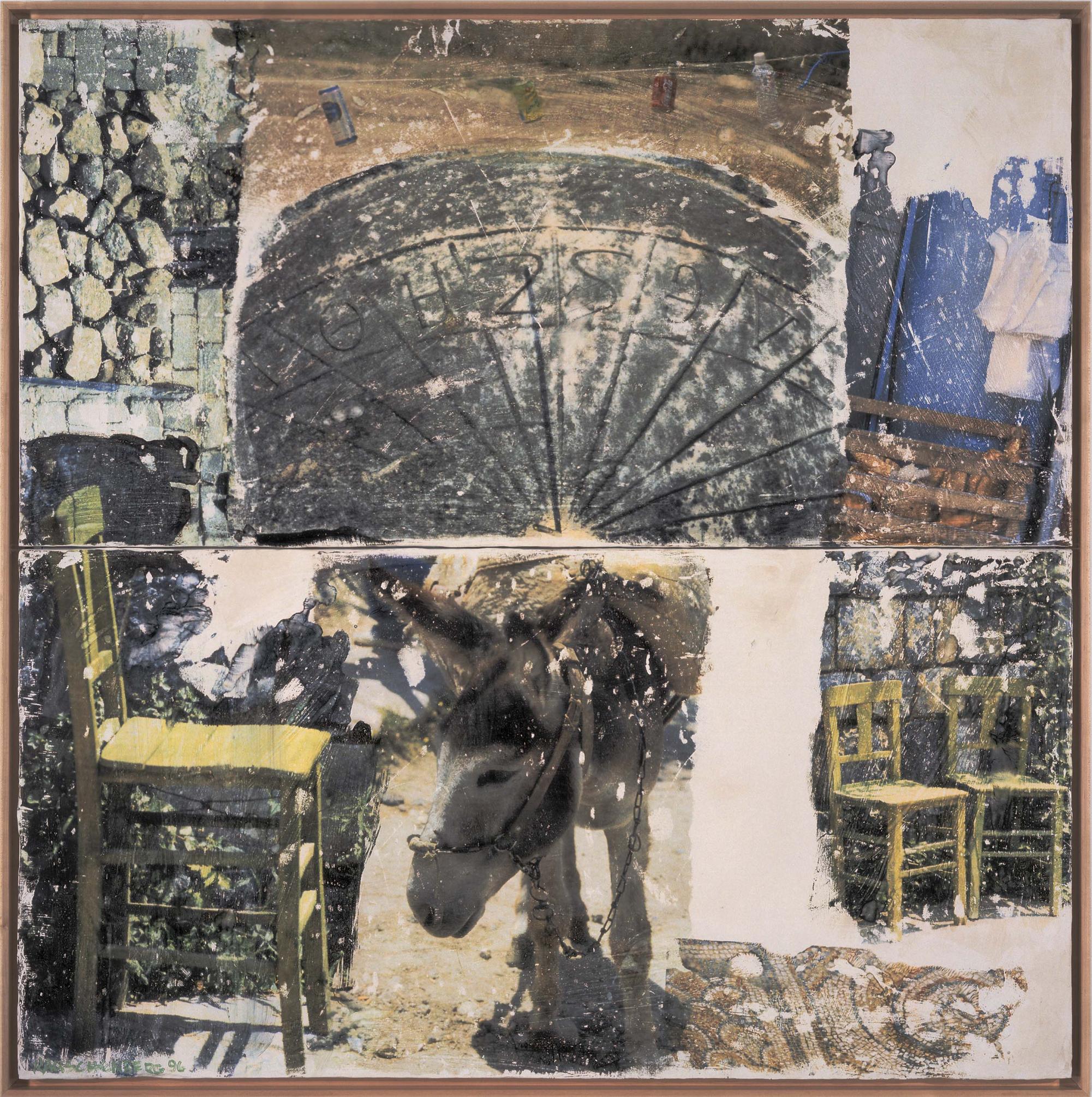
The last work that confronts the viewer at the Guggenheim SoHo and therefore in the exhibition as a whole, is particularly well-chosen: Codex (Arcadian Retreat), 1996. It is a fresco, one of the new techniques that Rauschenberg has been exploring since 1996. In the Arcadian Retreat fresco series, Iris prints (digital color prints of his photographs) were transferred to wet plaster surfaces in such a way that their color, clarity of focus and illusionism are maintained (the transferred images are closer in appearance to the original source photographs than at any other point in Rauschenberg’s oeuvre). A two-panel work bisected horizontally, Codex features in its lower half the image of a donkey set beside the image of a mosaic floor in such a way as to suggest that the animal is standing upon it. Directly above the donkey is the image of a portion of a great stone disk with Greek letters on it (it appears to be a portion of a sundial).
The composite image carries multiple associations. On the one hand, the donkey carrying its burden might represent Atlas holding the weight of the world on his back, the donkey, in this case, perhaps serving as a surrogate for the artist.20 Given the added suggestion of the mosaic “platform,” the image of the donkey surmounted by the semi-circle strongly recalls that of the stuffed Angora goat encircled by an automobile tire set on a horizontal platform in the famous Monogram (1955-59), which has also been associated with an age-old symbol: the scapegoat. As a “codex” is a manuscript book of scripture, a religious interpretation may be offered for the fresco as well, the donkey perhaps taken to represent the one that carried Jesus into Jerusalem on Palm Sunday, while Jesus’s presence is indicated by the giant halo or radiant orb (recalling the similar use of such forms in the art of Johns). As in Soundings, the images of chairs transferred onto the surface of this work, seen from two different vantage points, serve as an invitation to the viewer to enter the work and sit down; the implication here being one of calm, communion and repose. The viewer sits, while the artist shoulders the burdens of the world.
Infinitely superior in conveying the continued energy and inventiveness of Rauschenberg’s art than the display seen on the second floor of the Guggenheim SoHo was the self-retrospective offered by The 1/4 Mile or 2 Furlong Piece installed at Ace Gallery. To enter Ace Gallery with an eye for finding rhythms, repetitions, reversals and recurrent themes and images, was to be enriched, enthralled—and exhausted. Installed in a series of rooms of varying dimensions, The 1/4 Mile Piece is an environmental work consisting both of panels attached to the wall and freestanding sculptures, its scale intended to reach and eventually extend beyond the length indicated by its title. The piece is accompanied by an audio component: a taped collage of everyday sounds, such as street noises, household appliances, a baby crying, rain falling and so on. Selections from the work were shown at the Metropolitan Museum of Art in 1987. Although the piece began in 1981 and is said to be ongoing, offering a compendium of Rauschenberg’s techniques and styles dating from the time of its inception to the present day, it seems to have last been worked on sometime in the early 1990s, as no evidence of Rauschenberg’s most recent art-making techniques are seen.
When I saw the “Picasso and Braque” exhibition at MOMA some years ago, I was enthralled by one particular image of a guitar made by Picasso; it was a collage of fabrics held together with straight pins. I was struck by the inventive brilliance of the gesture (which resided in its sheer ordinariness) and the fact that it was not often repeated in Picasso’s art—he seems to have just been fooling around. I got the same feeling time and again while making my way through The 1/4 Mile Piece. It was accompanied by the recognition that literally hordes of artists can (and have) made entire, successful careers out of just one aspect of Rauschenberg’s production—from the assemblage sculpture to the montage of images to the abstract play of decorative, patterned fabrics. The 1/4 Mile Piece, moreover, seemed to carry suggestions for directions that have yet to be explored.
While any number of elements can be a point of focus when discussing this encyclopedic work, one element I found particularly appealing is the way in which effects of wind and weather extend through the piece. In one room was a series of white canvas panels against which sheets of newspaper appeared to have blown, depositing their imprints. In the next room, about a dozen man-tailored shirts seemed to have been thrown against the wall, flattening on impact. In still the next, a collection of cardboard boxes appeared to spring through the air (they are attached to Plexiglas armatures), while transferred onto facing canvas panels are multiple images of electric fans.
With his Combines and Silksceens of the ’50s and early ’60s, Rauschenberg was identified as a major transition figure between Abstract Expressionism and Pop art (by way of Assemblage). During the mid-’60s, he stood at the forefront of performance and technology-based art; around the same time, his early White Paintings came to be seen as precursors for Minimal Art and his Elemental Sculptures as antedecents of Process art. With the rise of Conceptual art, it became clear that he was among the first postwar American artists to revive Duchampian issues by putting art at the service of the mind. The emergence of both postmodernism and Neo-Expressionism in the 1980s made Rauschenberg’s work newly relevant, shedding light on his preoccupation with reading and meaning (allegory and metaphor), his eclecticism, his focus on the photographic image and his appropriation of images from the mass media and the culture at large.
From the vantage point of the late ’90s, Rauschenberg’s art—and especially his undervalued “later” work—is revealed as newly contemporary in its concerns. The focus of Documenta X in Kassel, Germany, which closed just as the Rauschenberg retrospective at the Guggenheim opened, was on art as a form of social criticism and tool for bringing about political enlightenment. Dedicated to “Politics-Poetics,” Documenta explored political expression in today’s art and featured work that addresses issues of weaponry, political oppression, freedom, globalization, world capitalism, ecology and sexual difference. While many of Rauschenberg’s contemporaries (among them Oyvind Fahlstrom and Richard Hamilton) were included in the exhibition, Rauschenberg was not only excluded but was not even mentioned (as far as I could tell) in the 800-plus-page book that accompanied the show. Yet his presence was everywhere felt—most obviously, in the influence his work has exerted on the exhibition’s participants, especially in pieces in which photographs, texts and found objects (among them live pigs) are used for evocative effect and as a tool for communication (e.g., works by Rem Koolhaas, Kerry James Marshall, Gerhard Richter, Rosemarie Trockel, Carsten Holler and others). It was felt, as well, in the montage-style of the book design (one often does a double-take, convinced that the layout was devised by Rauschenberg, particularly in portions where photographs are overlaid by text in the manner of his design for Andrew Forge’s monograph of 1969).
While Rauschenberg’s exclusion from Documenta can on the one hand be explained by the fact that the show focused on nontraditional modes of art-making that stand apart from modernist esthetics (Catherine David, the show’s organizer, being convinced that esthetic and political values are mutually exclusive21), it can on the other hand be argued that Rauschenberg’s strategy is all the more effective (and subversive) in its continued preoccupation with painting and its reliance on beauty to compel attention and convey meaning. Rauschenberg’s move into alternative media (performance) lasted but a short time; it was for him, I believe, ultimately unsatisfying because it reached only a narrow, art-literate, “insider” audience. He chose instead to create accessible work geared to visual stimulation and direct physical appeal, using his position as an internationally acclaimed artist to address his concerns about political and social issues to a global audience. With old-fashioned optimism and a faith in communication as a tool for promoting cooperation and understanding, he travels the world speaking to people of different cultures in a language of images both exotic and familiar. Thus in both his art and his life, Rauschenberg has stood for decades as a model for today’s politically committed artist. □
- “Art: Galleries-Uptown—Group Shows,” The New Yorker, July 21, 1997, p. 15.
- Rauschenberg’s Bed (1955), with its red, white and blue quilt, must also be understood in relation to Johns’s Flag. One of Rauschenberg’s most celebrated works, it is ironically also his most “Johnsian” Combine, one of the only single-image works he was to produce. Like Flag, Bed features a coidentity of object and image and a collapsed figure-ground relationship. In Rauschenberg’s piece, however, nothing is repressed or concealed—an erotically charged bed is revealed as the locus of his concern.
- This was related to me by the collector when I visited his home on June 20,1982.
- Interview with the artist, June 6,1983.
- According to Jonathan Katz, this work contains not only the photograph of Johns, but letters from him as well, “judiciously torn up.” For an excellent discussion of Rauschenberg and Johns’s relationship in the context of the art world of the 1950s, see Katz, “The Art of Code: Jasper Johns and Robert Rauschenberg,” in Whitney Chadwick and Isabello de Courtivron, eds., Significant Others: Creativity and Intimate Partnership, New York, Thames and Hudson, 1993, pp. 189-207.
- Photographs of Rauschenberg in his all-white wedding clothes, taken on Outer Island, Conn., in June 1950, are reproduced in Mary Lynn Kotz, Rauschenberg: Art and Life, New York, Harry N. Abrams, , 1990, p. 70, and in Dodie Kazanjian, “Captiva Audience,” Vogue, September 1997, p. 656.
- Kenneth Bendiner, “Robert Rauschenberg’s Canyon,” Arts Magazine, June 1982, pp. 57-59.
- Written on the sheet of paper in Wager is the following: “The impossibility is comm/to control/to recall/the precise image.” Duchamp had written, “to reach the Impossibility of sufficient visual memory to transfer from one like object to another the memory imprint.” Marcel Duchamp, The Bride Stripped Bare By Her Bachelors, Even. New York, Jaap Reitman Inc., 1976, n.p.
- Robert Rauschenberg, “Random Order,” Location, Spring 1963, pp. 27-31. For a discussion of Rauschenberg’s article, see Roni Feinstein, Robert Rauschenberg: The Silkscreen Paintings, 1962-64, cat., Whitney Museum of American Art, New York, in association with Bulfinch Press, Little, Brown and Company, 1990, p. 23. For an opposing interpretation of “Random Order” see Rosalind Krauss, “Perpetual Inventory” in Robert Rauschenberg: A Retrospective, exhib. cat., Guggenheim Museum, New York 1997. pp. 209-212
- It seems to come naturally to him to see the world through a Cubist filter. In photographs taken throughout his career, he has gone out into the world and found “Rauschenbergs.” Rome Flea Market (V), 1952, for example, is a Combine before the fact in its scaffoldlike structure and plays of opposition (straight/curved, round/flat, hard/soft, large/small and so on).
- In Rauschenberg’s art, elements rhyme, collide, repeat, reverse and hover at the edge of meaning and it is interesting in this regard to consider that he is severely dyslexic: while reading, letters apparently drift and float about the page. Although this perceptual disorder in no way accounts for the appearances of his art (all dyslexics do not create Rauschenbergs), it may have contributed to the development of his acute visual sense and of an art in which fragments are pieced together to convey meaning.
- Brian O’Doherty, “Rauschenberg and the Vernacular Glance,” Art in America, September-October 1973, pp. 82-87.
- Quoted in G.R. Swenson, “Rauschenberg Paints a Picture,” Art News, April 1963, p. 45.
- Ibid.
- Moira Roth, “The Aesthetics of Indifference,” Artforum, November 1977. pp. 46-53.
- Max Kozloff, “Art,” The Nation, Dec. 7,1963, p. 403.
- Max Kozloff, “American Painting During the Cold War,” Artforum, May 1973, p. 53. Kozloff wrote, “Rauschenberg secretly financed much of the Artists’ Peace Tower against the war in Los Angeles in 1965. But he also celebrated the triumph of American space flight technology, the trip to the moon, for NASA in 1969.” At the time, Kozloff saw this as contradictory and criticized Rauschenberg for his ambivalence.
- Rauschenberg, in a statement prepared for the exhibition of Currents at Leo Castelli Gallery, New York, June 1970.
- In the early ’60s, Johns’s work began to move in the direction of Rauschenberg’s Combines. Single-image painting was left behind in favor of works that were part-by-part composed, that often incorporated three-dimensional objects and that were more emotive in content. However, it has been in Johns’s more recent work, produced since 1982, that he has come closest to Rauschenberg in painted works employing depicted forms and trompe l’oeil illusionism in which images are layered and dispersed across the picture surface, engaging in a play of reading and meaning and a context of self (one steeped in childhood experience and religious contemplation). See Roni Feinstein, “Jasper Johns: The Examined Life,” Art in America, April 1997, pp.78-89, 128.
- This was not the first time Rauschenberg employed this symbolism in his art. ROCI (Rauschenberg Overseas Cultural Interchange) had also been named for Rocky, Rauschenberg’s aged pet turtle, who was used as the ROCI mascot. The turtle is an Oriental symbol that, like Atlas in the West, carries the world on his back and Rauschenberg identified his artistic mission in ROCI with that of the Oriental turtle, Kotz, p. 20.
- See Ken Johnson, “A Post-Retinal Documenta,” Art in America, October 1977, pp. 80-89.
- “Robert Rauschenberg: A Retrospective” debuted at the Solomon R. Guggenheim Museum, the Guggenheim SoHo and Ace Gallery in Manhattan [Sept. 19, 1997-Jan. 7, 1998]. It is currently on view in Houston at the Menil Collection, the Contemporary Arts Museum and the Museum of Fine Arts [Feb. 13-May 17]. It will travel to the Museum Ludwig, Cologne [June 27-Oct. 11] and the Guggenheim Museum Bilbao [Nov. 20, 1998-Feb. 26, 1999]. The exhibition, curated by Walter Hopps and Susan Davidson, is accompanied by a 631-page catalogue.
Author: Roni Feinstein is an art historian and critic based in Boca Raton, Fla.